Movie Posters ☆
Movie Posters ☆

I, TONYA (2022)
Tools: Digitally drawn on Procreate; billing block logo vectoring done on Illustrator; typography & layout on InDesign
Project Statement: The aim of this project was to elevate the original movie poster for “I, Tonya” through the sophisticated integration of typography, imagery, and color. This project provided a unique opportunity for me to hone my skills in large scale printing techniques (27x40 in) and expand my proficiency with various design software and color models (RGB and CMYK).
The initial poster for “I, Tonya” failed to adequately convey the tumultuous life of ice skater Tonya Harding, who endured abuse from her mother, husband, and the media, amongst other trials and tribulations. My objective was to create a poster that would give audiences a glimpse into the struggle and pain that Tonya endured in order to meet the strict and unrealistic beauty standards imposed upon her by American skating associations. The scene I selected for the poster is emblematic of her inner turmoil and represents a turning point in the lead up to the 1994 Winter Olympics. I used Procreate to render Tonya in a manner that is both satirical and unsettling, yet sure to pique the curiosity of viewers. The addition of running mascara to the original image and the use of typography that mimics the marks of ice skates serves to accentuate Tonya and her name as the focal points of the composition. My ultimate goal was to inspire audiences to delve deeper into Tonya's story and to understand the mask she was forced to wear in order to pursue her passion for ice skating.

BLACK SWAN (2022)
Tools: Photo editing/rendering on Photoshop; billing block logo vectoring done on Illustrator; typography on InDesign
Project Statement: The objective of this project was to produce a visually stunning movie poster that effectively captured the essence of the film's overarching theme. My approach was to showcase one of the film's most memorable scenes, wherein two rival ballerinas engage in a dramatic confrontation that results in the shattering of a mirror. To symbolize this climactic moment, I arranged various stills from the film with artful precision within the fragmented remnants of the broken mirror. The deft utilization of scarlet tones throughout the poster serves to evocatively illustrate the physical and emotional — and often bloody — tribulations faced by the dancers in their strenuous and cutthroat lifestyle.
Branding ☆
Branding ☆
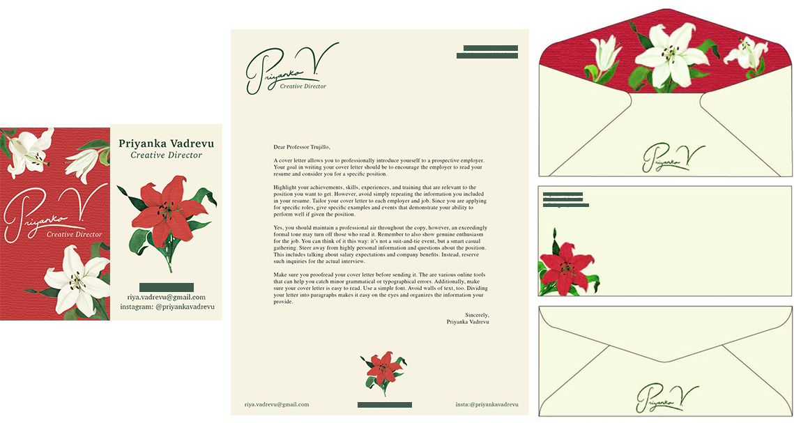
LILIUM: THE STATIONARY SET (2022)
Tools: Signature & floral logo drawn on Procreate; card & cover letter layout on InDesign; envelope design on Illustrator
Project Statement: The objective of this project was to craft a personalized stationery set that would reflect my personal aesthetic and serve as a manifestation of my personal brand. Inspired by my adoration for the lily, or lilium, I embarked on a creative journey to imbue each piece with the essence of this magnificent floral symbol. My logo design and typography were carefully crafted to impart a timeless elegance, sophistication, and classicism, while incorporating a contemporary infusion of color to provide a modern edge. The resulting stationery set embodies the perfect balance between traditional elegance and contemporary flair, sense of style.
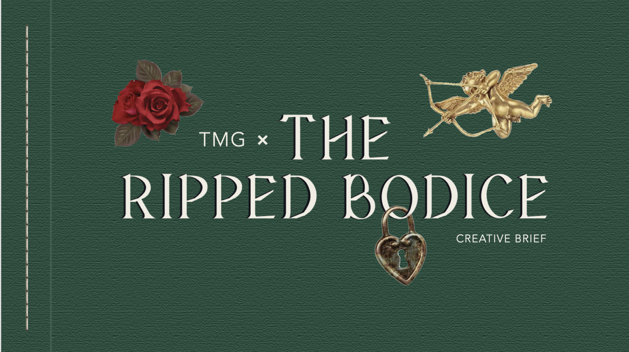
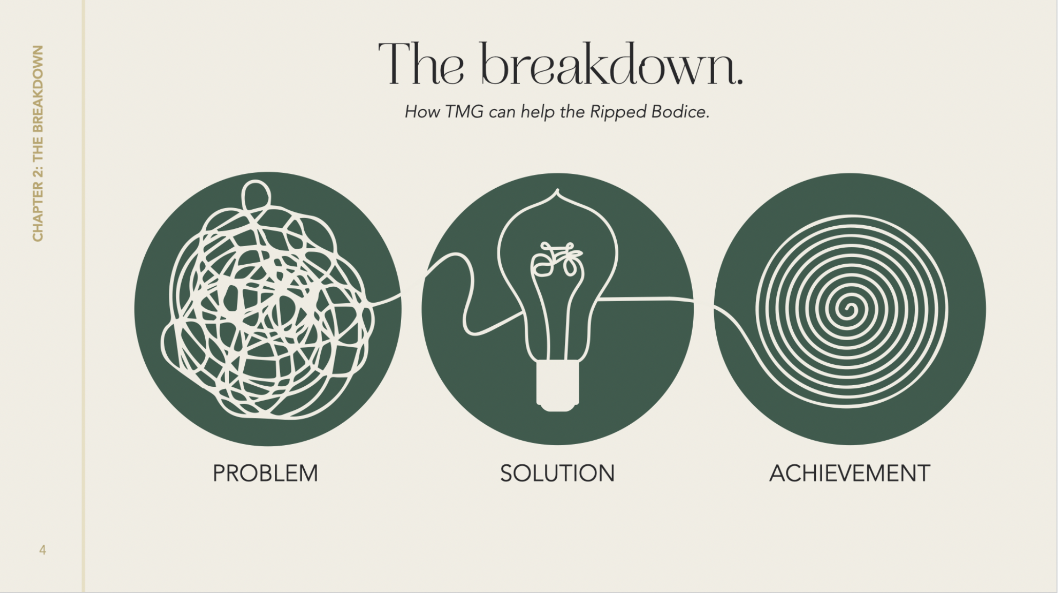
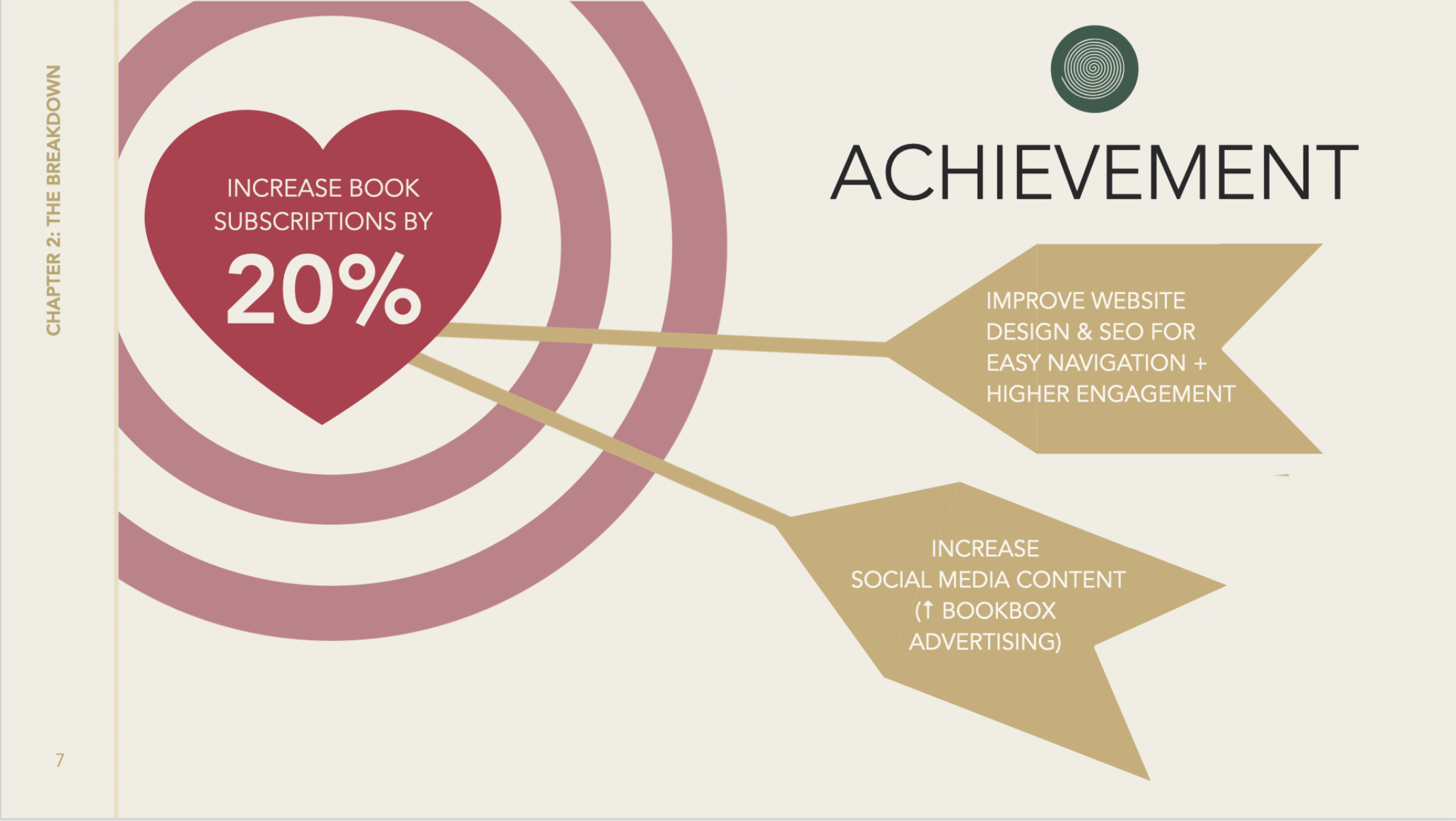
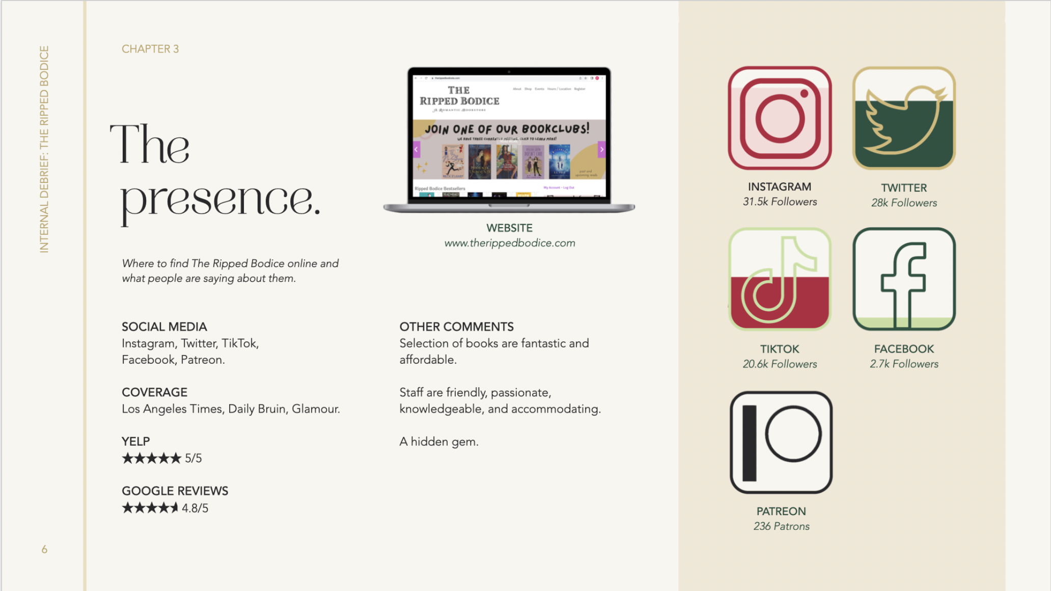
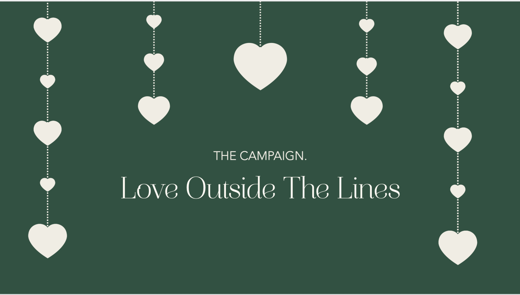
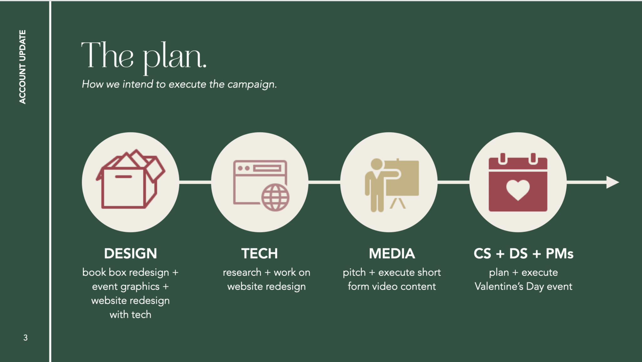
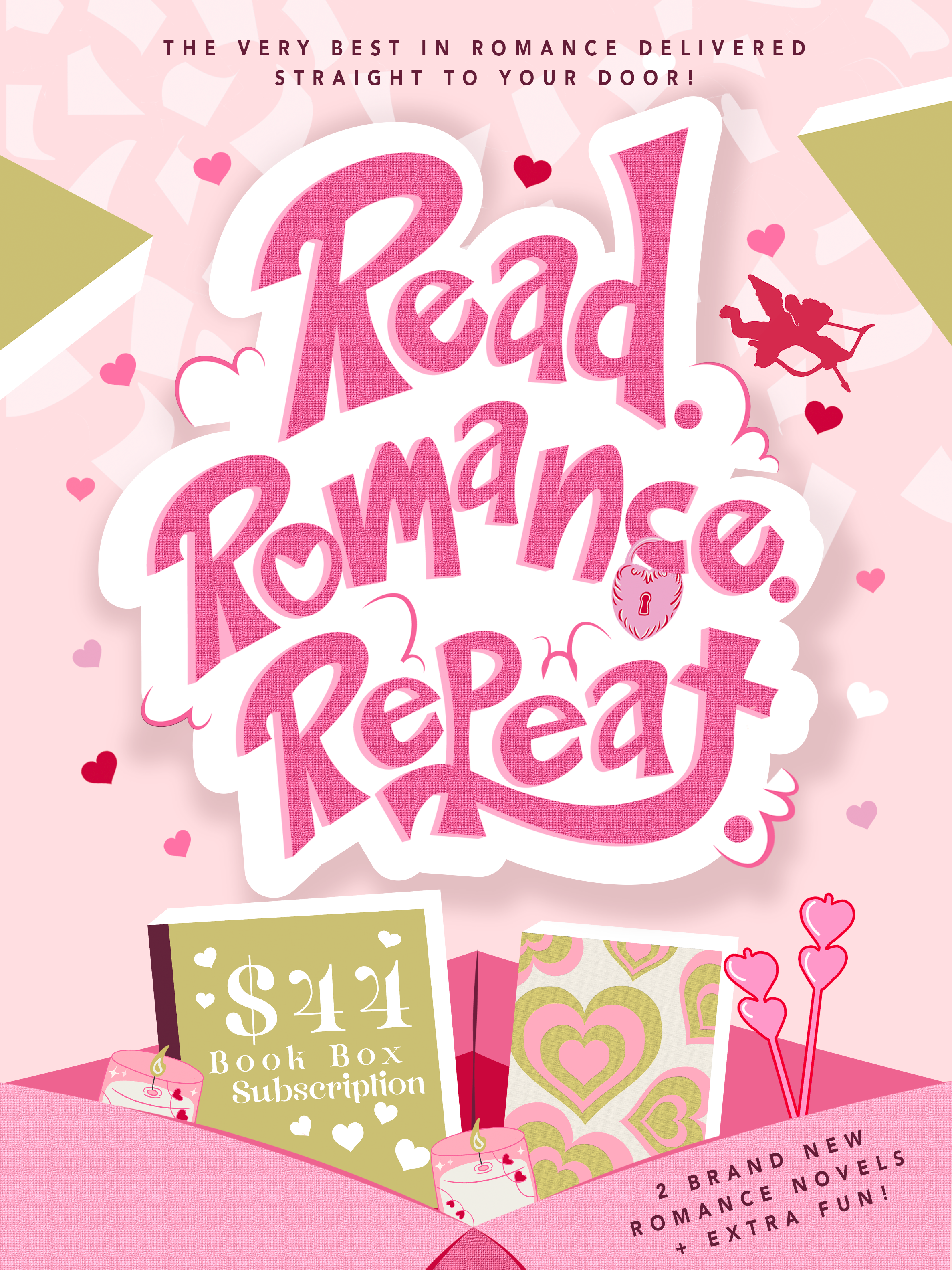
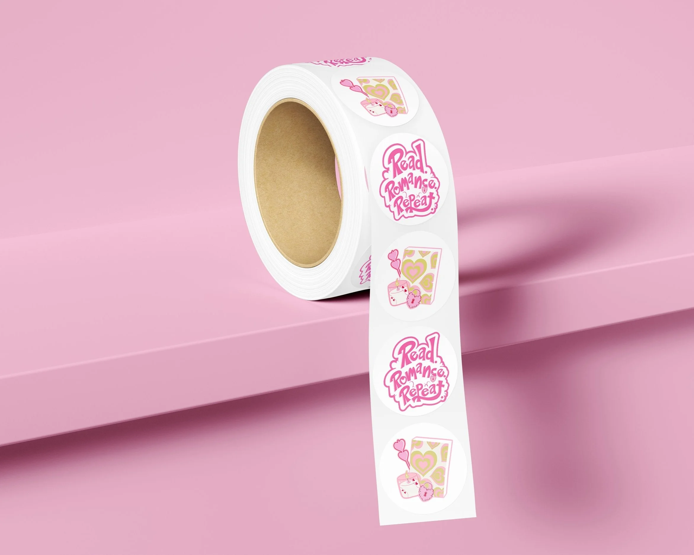
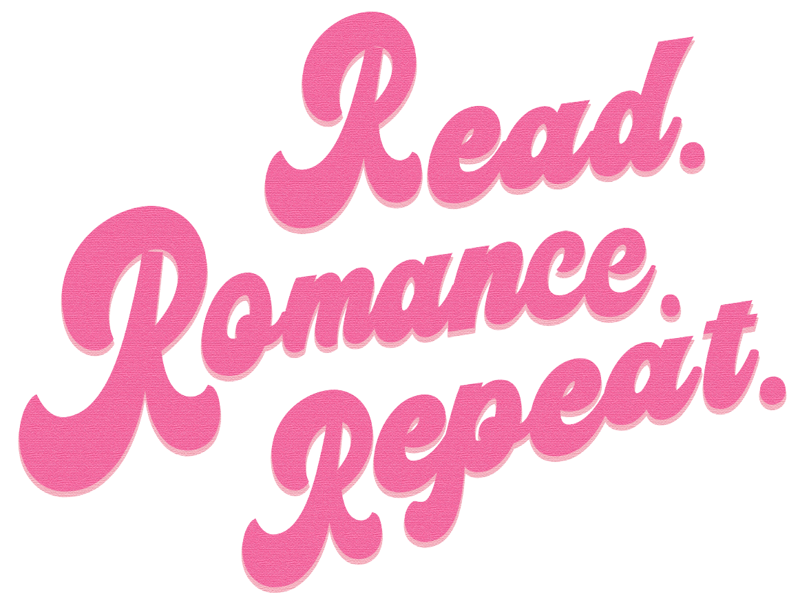
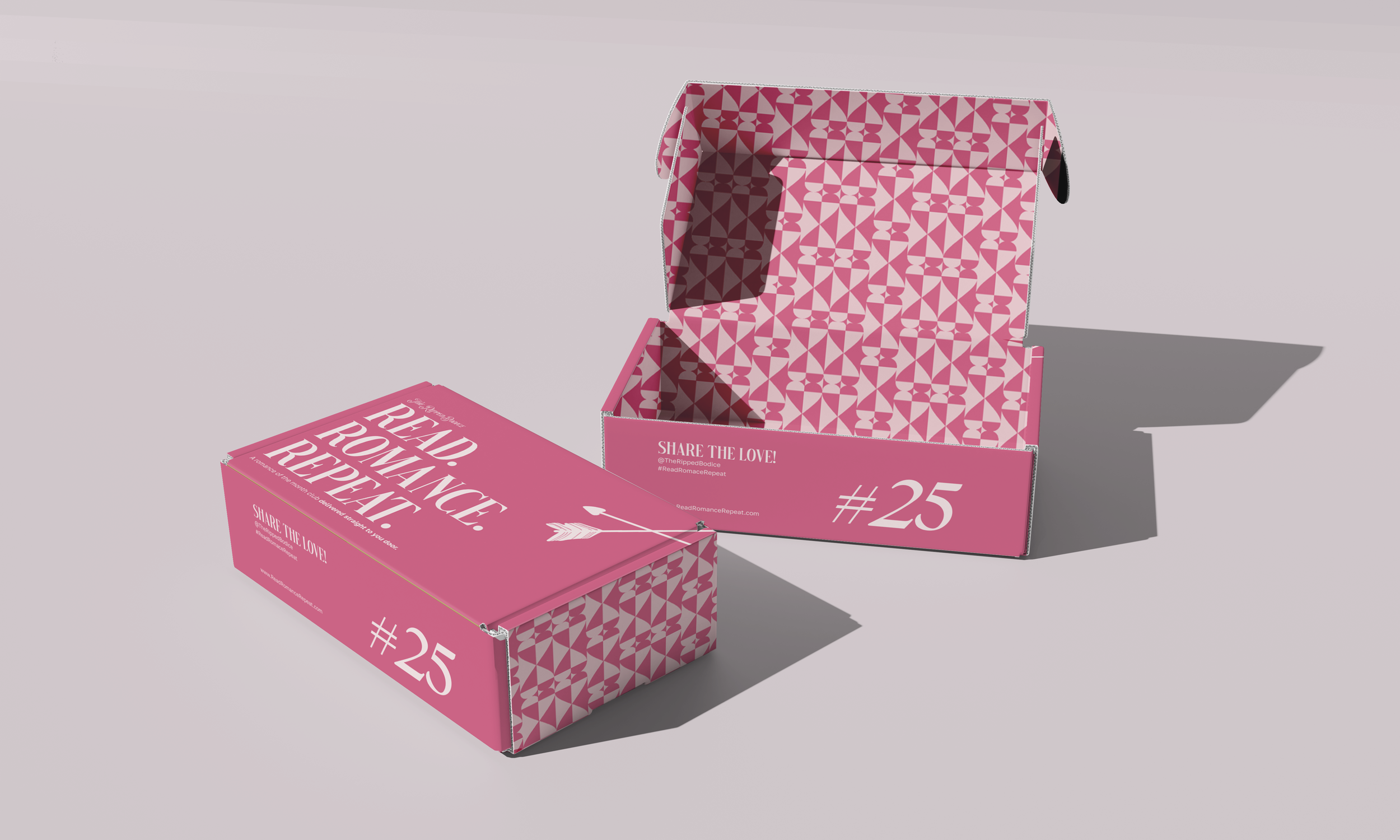
TROJAN MARKETING GROUP X THE RIPPED BODICE (2023)
Tools: Key Note; Photoshop; Illustrator
Project Statement: As a designer at Trojan Marketing Group, I play pivotal role in asset design for our client The Ripped Bodice’s campaign. As a boutique romance bookstore located in Culver City, The Ripped Bodice presented a unique challenge and opportunity to showcase my design prowess. My responsibilities include the conceptualization and implementation of color guides and branding, as well as spearheading the visual direction of our team’s campaign. I was also tasked with overseeing the creation of all design assets, including deck design (from research to creative, to campaign briefs), event/promotional graphics, a comprehensive website redesign, and a reimagining of their book box packaging design. This campaign is ongoing with more assets to come.


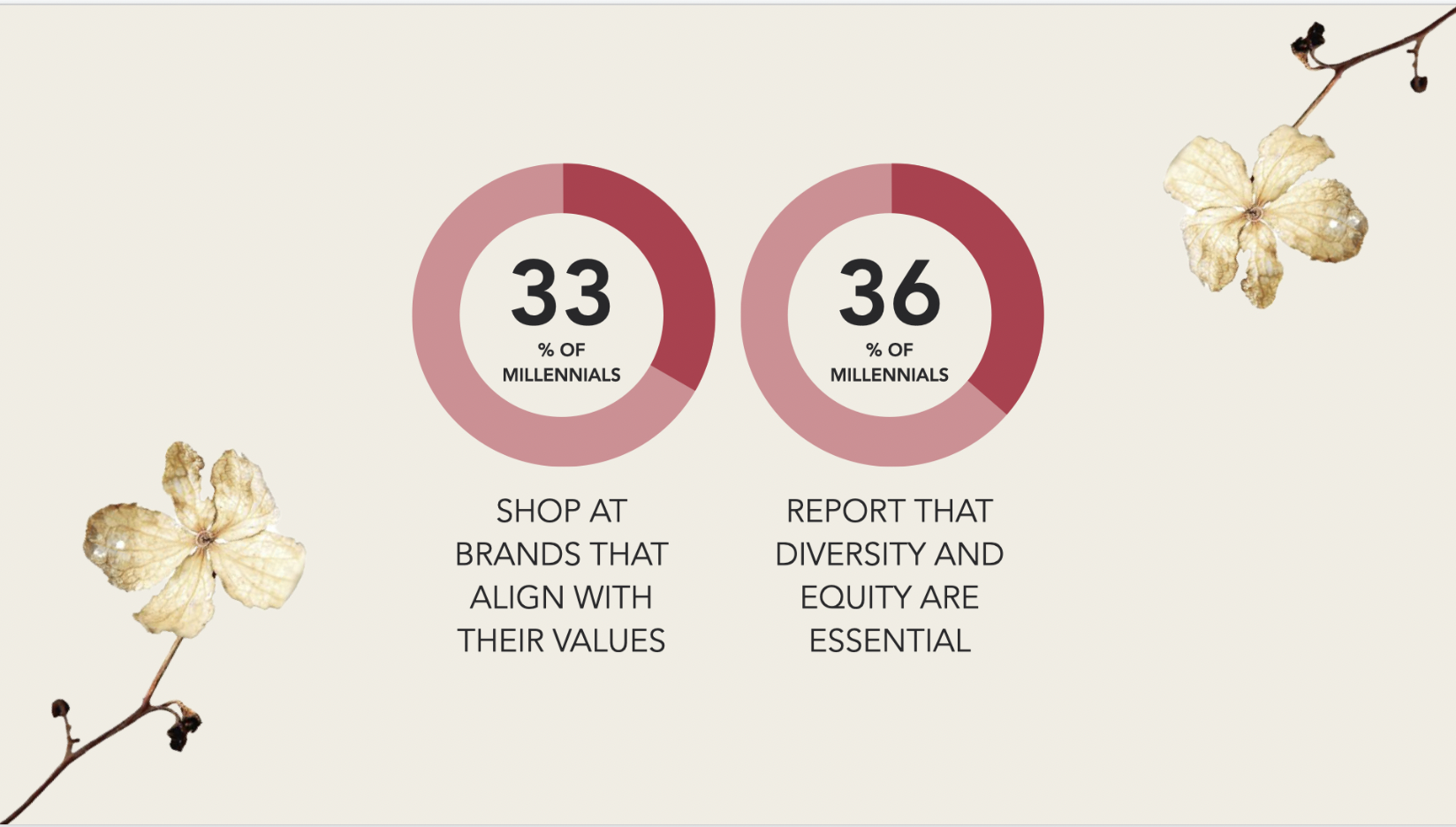


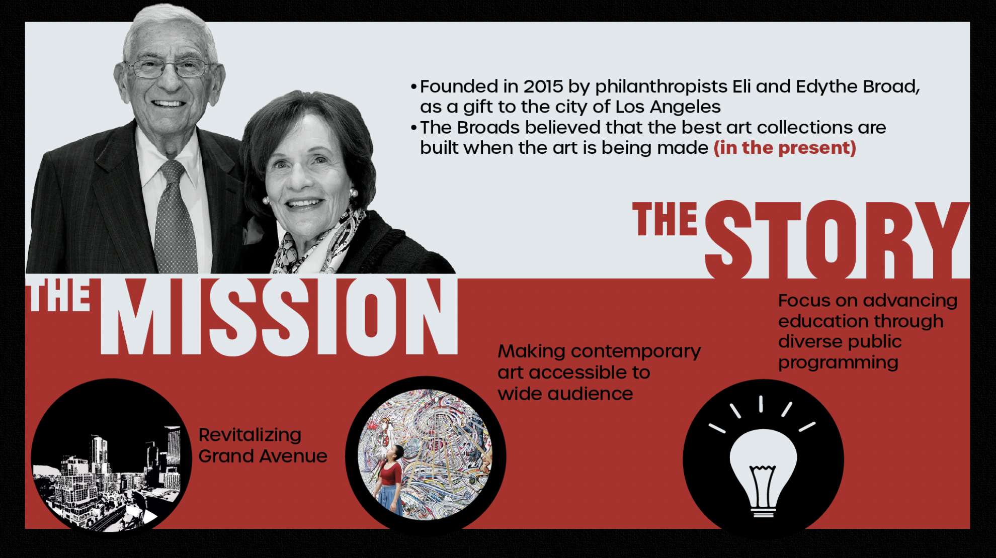
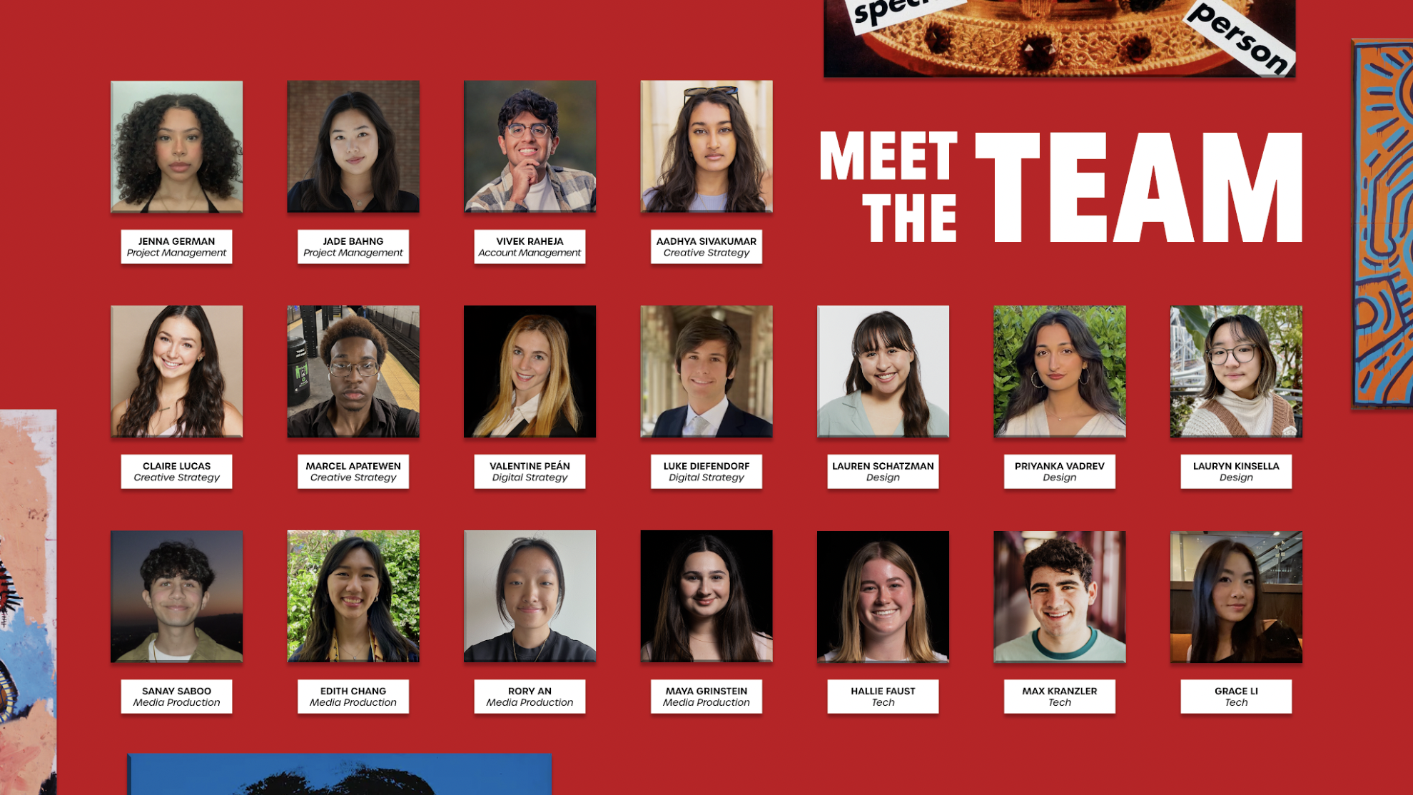
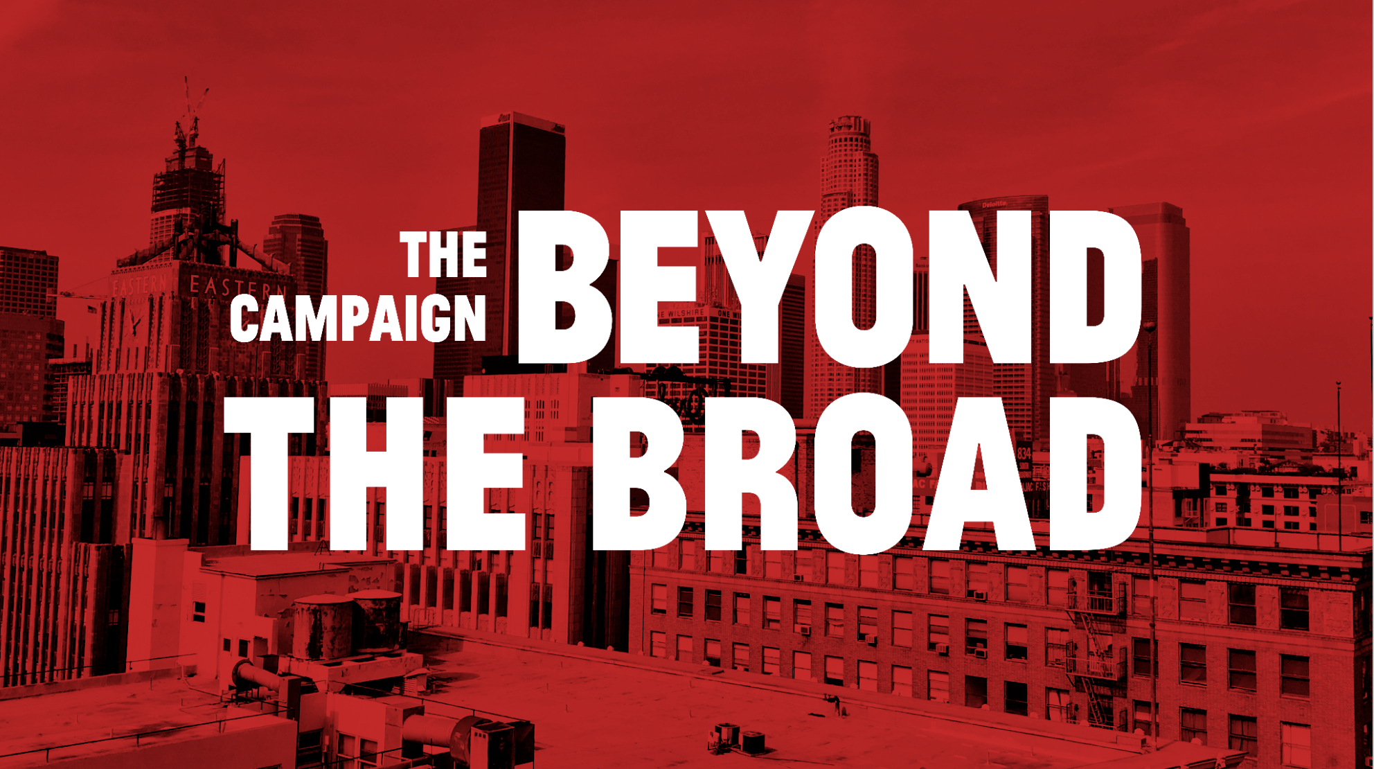
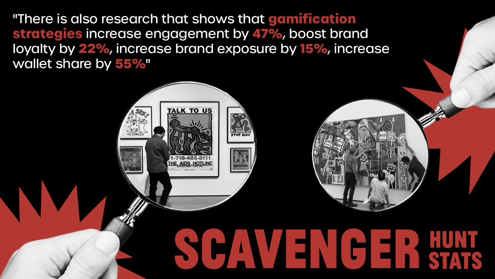
TROJAN MARKETING GROUP X THE BROAD MUSEUM (2023 - ONGOING)
Tools: Photoshop; Illustrator
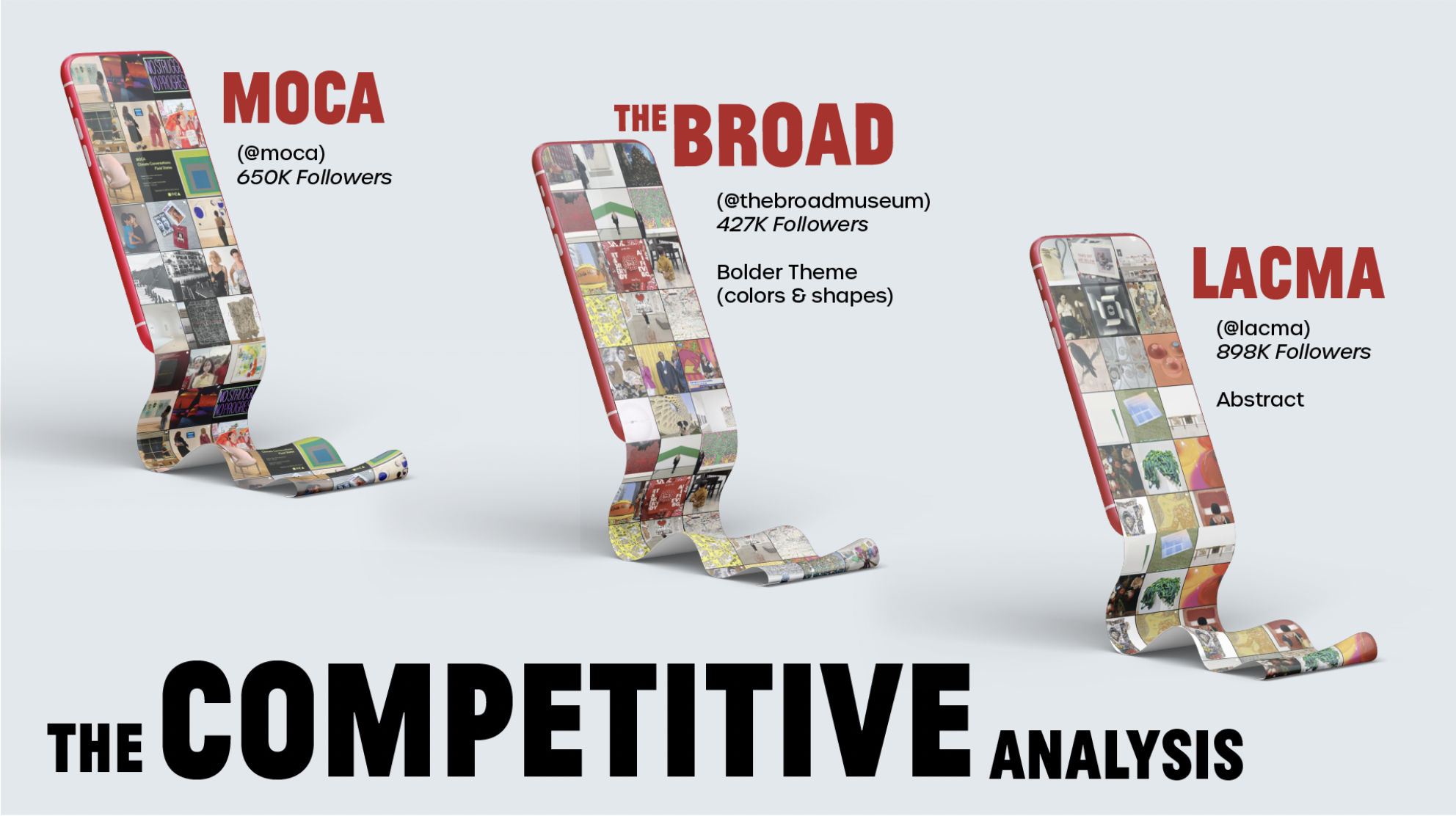
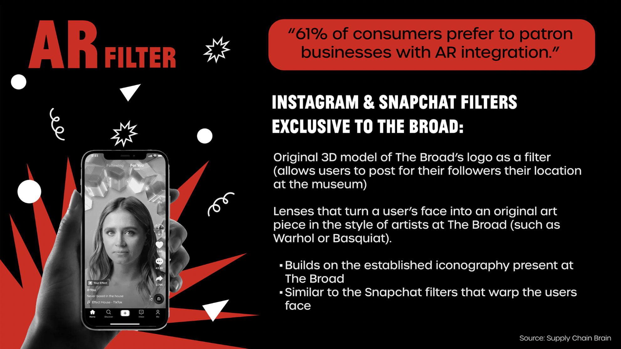
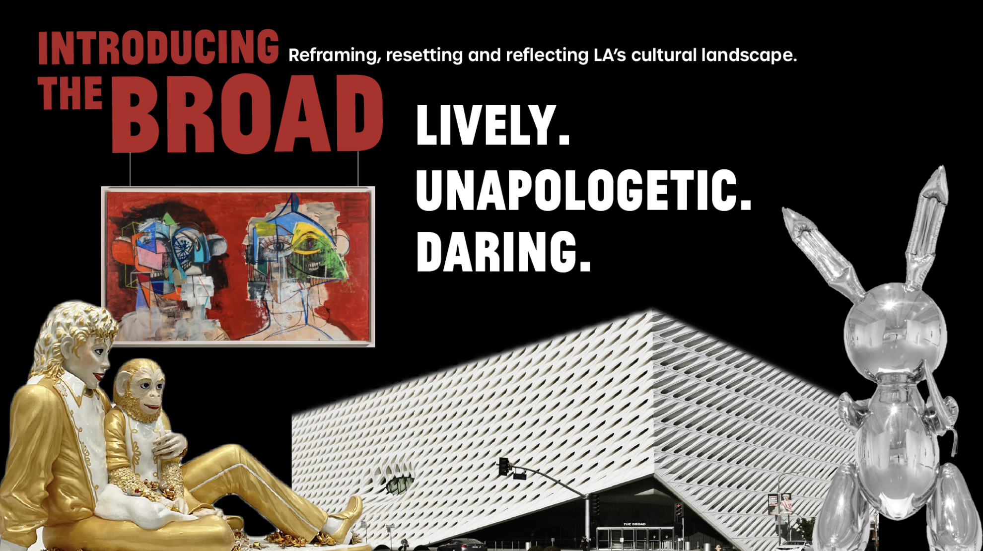
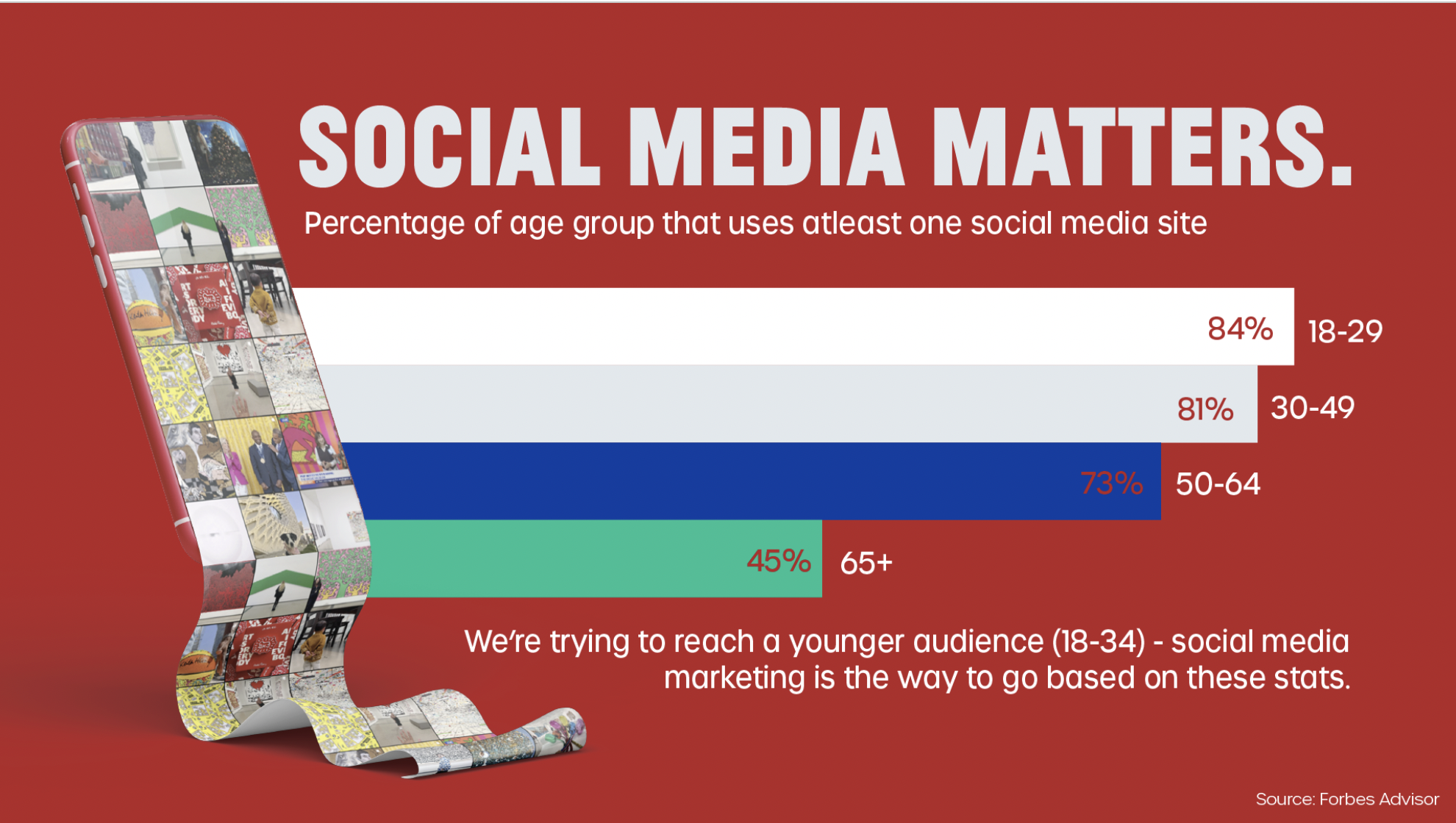
Project Statement: As a designer at Trojan Marketing Group, I play pivotal role in asset design for our clientThe Broad Museum’s ongoing campaign to increase community engagement. I play a pivotal role in the creative development of our campaign, emphasizing community engagement and ideating how to bolster the brand's social media presence. From deck design, including color schemes and fonts, to contributing ideas for in-person events, social media guidelines, and AR filters, my focus remains on upholding the Broad's contemporary art identity. Additionally, I contribute to the design of graphics, stickers, and exclusive merchandise for our upcoming spring 2024 event, ensuring a cohesive and impactful brand representation throughout product ideation.


FREELANCE LOGO DESIGN (2023)
Tools: Photoshop; Ilustrator
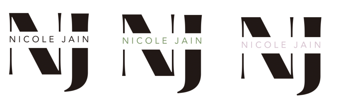
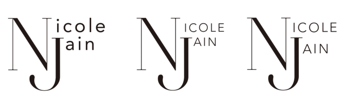
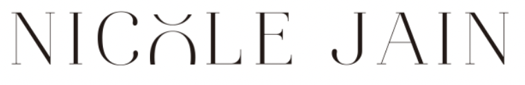
Project Statement: The client sought a logo that was clean, organized, and exuded an air of elegance. In response to this request, I presented a range of logo designs that encapsulated these principles. After careful consideration, the client chose one of my designs to serve as the official logo for her brand. This logo was then incorporated into her website redesign, which was also designed by myself. To fully appreciate the chosen logo, I invite you to view the web design section, where you can see the logo in its intended context on the client's website.


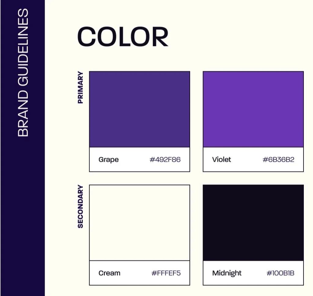
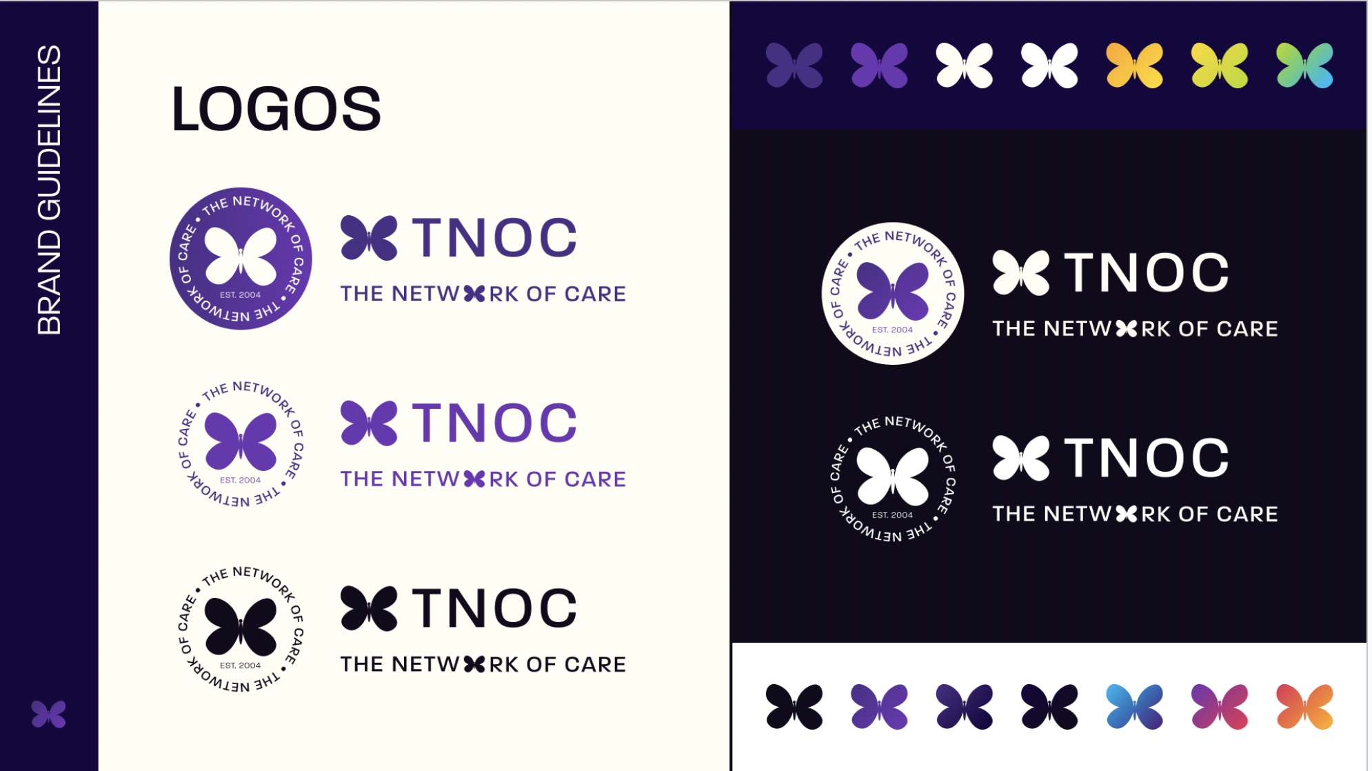
AVENUES CONSULTING X THE NETWORK OF CARE (2023 - ONGOING)
Tools: Figma, Ilustrator
Project Statement: As a design consultant for Avenues Consulting, my objective was to revitalize The Network of Care’s, a non profit dedicated to serving families with ill children, logo and brand guidelines, aligning them with the organization's narrative while incorporating a modern aesthetic. The aim was to maintain the essence of the organization's story, with a specific focus on preserving the old logos butterfly element and emphasizing the color purple as the primary hue. This strategic approach ensures that Stephanie Frazier, the women the organization was founded in legacy of, remains at the forefront of the brand's narrative.


“OTHER” USC ROSKI ART EXHIBITION (2022)
Tools: Figma, Photoshop, Ilustrator, InDesign
Project Statement: The "Other" exhibition was a post-material art show for upperclassman at USC's Roski School of Art and Design. My role in this project was to lead the communication design team and create promotional assets, including exhibition posters and social media graphics. Working in collaboration with the professor and students, I aimed to produce designs that reflected their desired aesthetic of symbolic decay. The event was hosted in the USC Village and my efforts were focused on promoting the exhibition to a wider audience and generating interest in the unique and thought-provoking works on display.

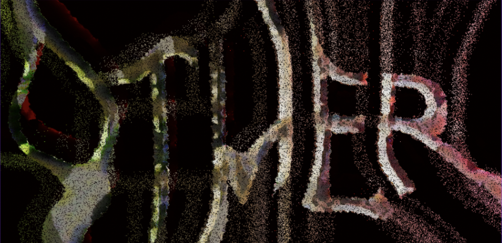


signage place outside venue (2022)
Product ☆
Product ☆
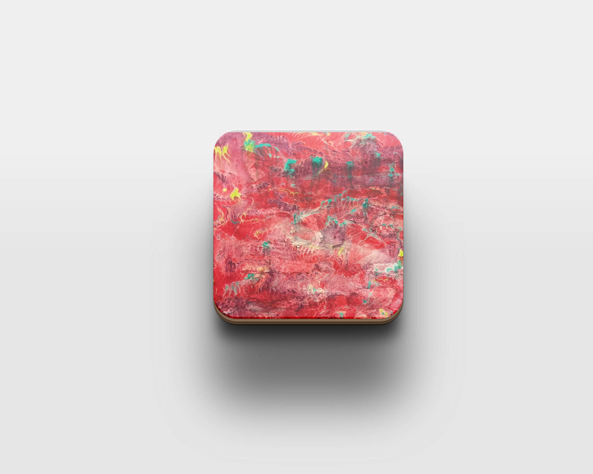
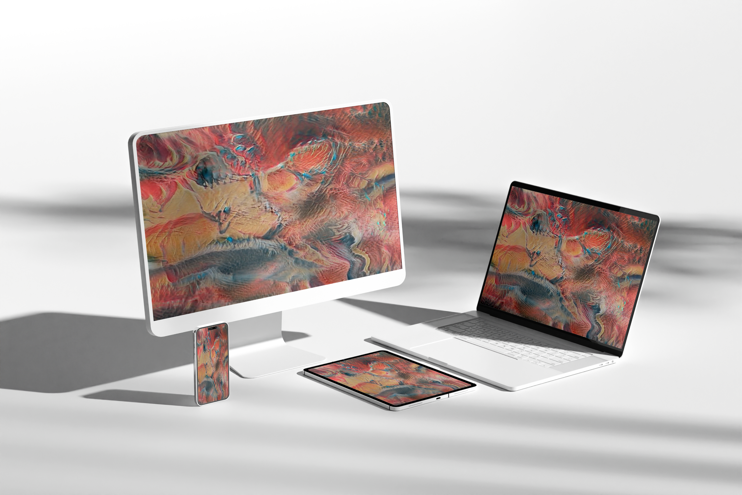
MULTI MEDIUM INTERIOR DESIGN (2022)
Tools: Water marbling; laser-cutting; 3D printing; Photoshop; Ilustrator; Runway AI Programming
Project Statement: The objective of this project was to create unique and personalized artwork for interior design spaces, showcasing my personal design style characterized by vivid colors, texture, organic shapes/patterns, and a mix of mediums. The project involved creating four 16in x 24in 2D pieces for wall display, including one laser-engraved work, two water marbled pieces, and a 3D-printed map of my hometown. I also replicated each composition into coasters and created an AI animation that morphs the four compositions for use as laptop, tablet, phone, or desktop screen savers. The pieces were customized to fit the style of my house, but they can be easily altered to meet the preferences of various clients. This project provided an opportunity to pursue my interest in interior design and explore my design style.


WEB ☆
WEB ☆
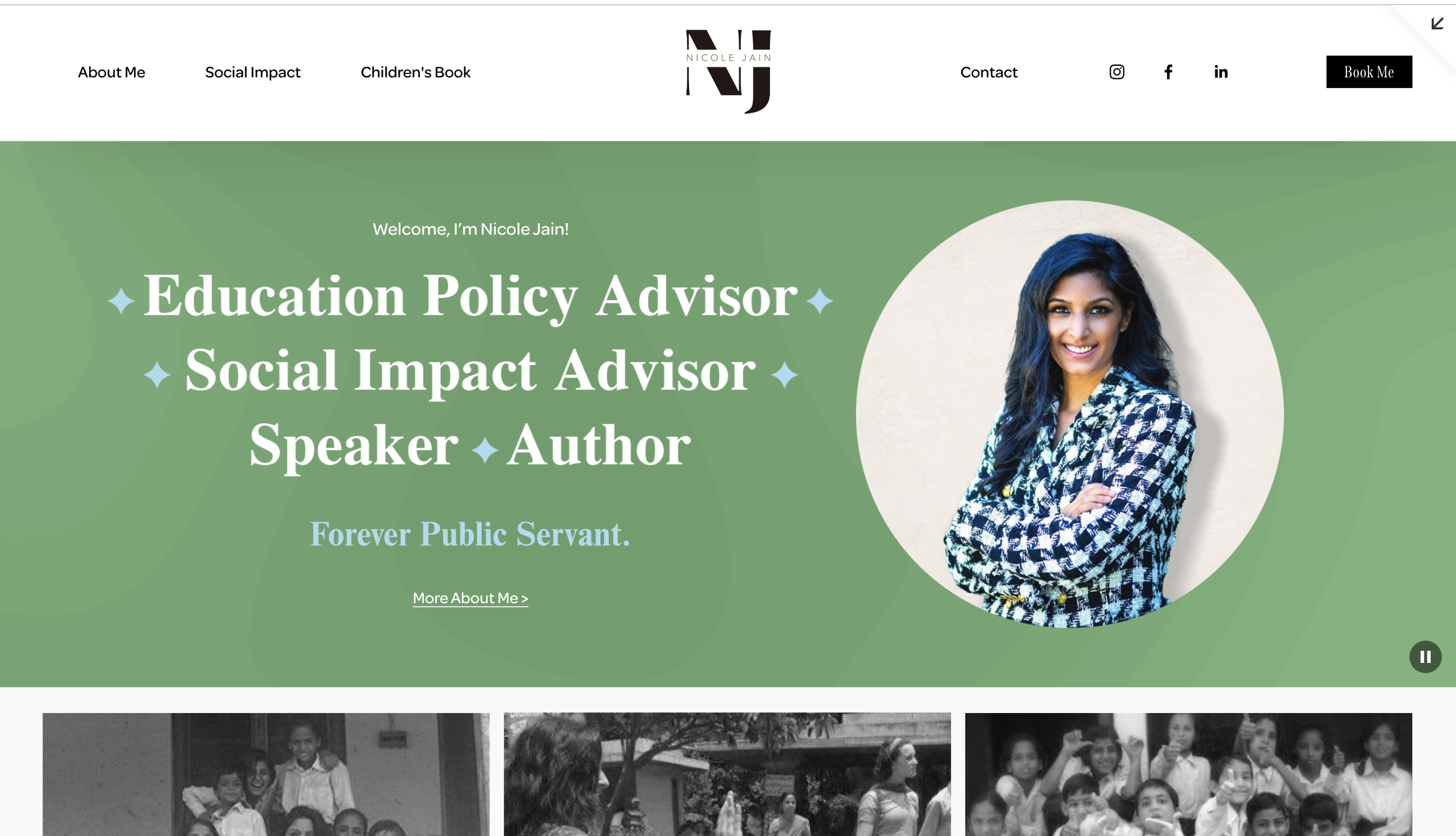


NICOLE JAIN WEBDESIGN (FREELANCE) (2023)
Tools: Photoshop; Ilustrator; Squarespace
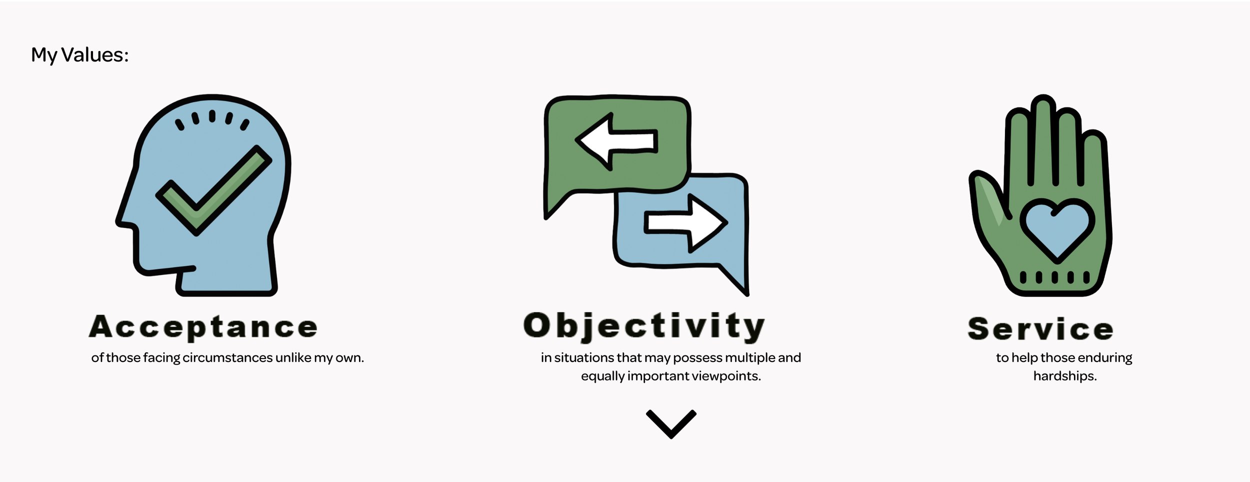
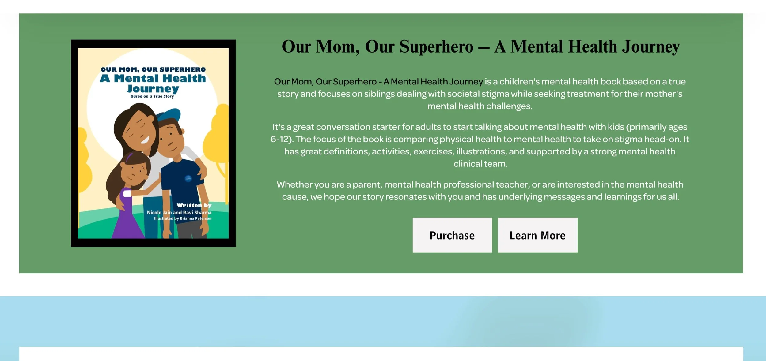
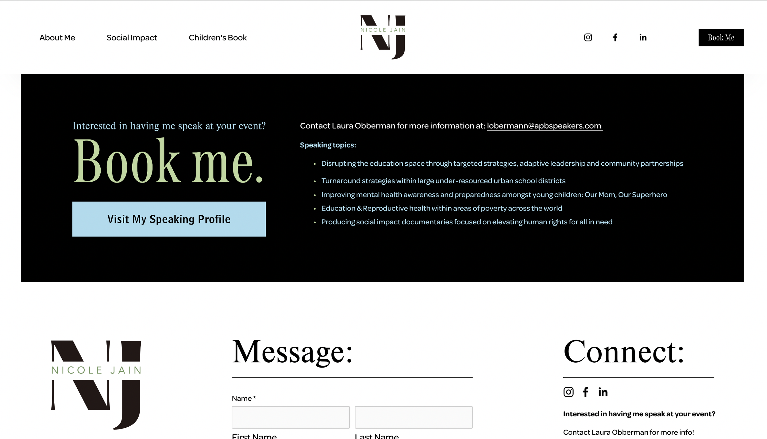
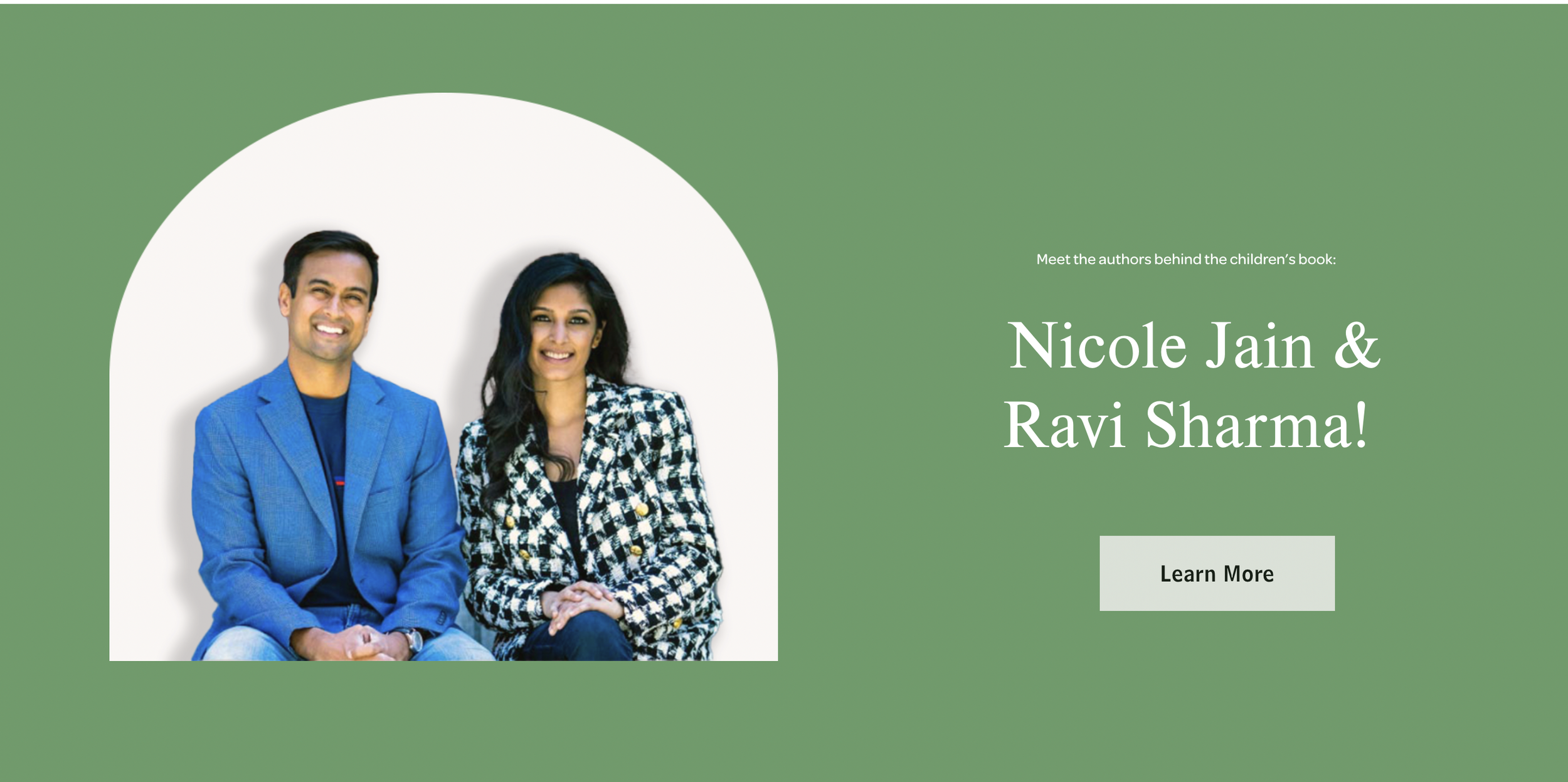
Project Statement: The purpose of this project was to create a visually compelling and functional website for Nicole Jain to showcase her personal brand as an author, education advisor, public policy advisor, and speaker. With a focus on minimalism and a color palette of green and blue, I carefully considered every design choice to accurately reflect Nicole's personal aesthetic and achieve her desired visual identity. Throughout the two-month development process, I worked to create a website that was easy to navigate, with a strong emphasis on IT functionality, mobile compatibility, and external links to connect Nicole with her audience. Every aspect of the website was carefully crafted to provide a seamless user experience and accurately represent Nicole's brand, showcasing her skills and expertise to her target audience.


PERSONAL WEB PORTFOLIO (2022)
Tools: HTML/CSS
Project Statement: The following website was coded from scratch using HTML and CSS. It serves as a portfolio that showcases my personal photography in addition to individual HTML/CSS projects I have done.
Typography ☆
Typography ☆
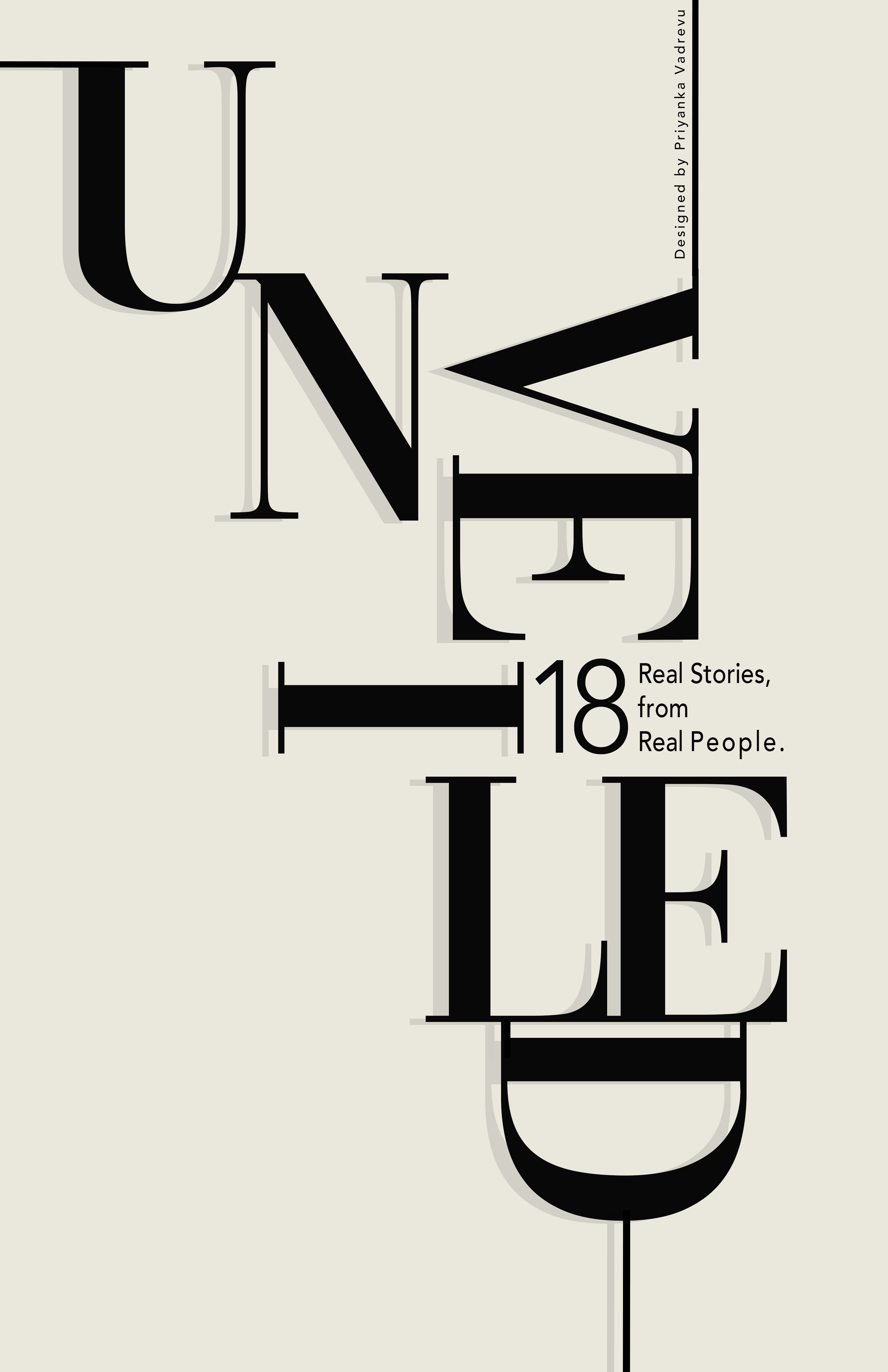
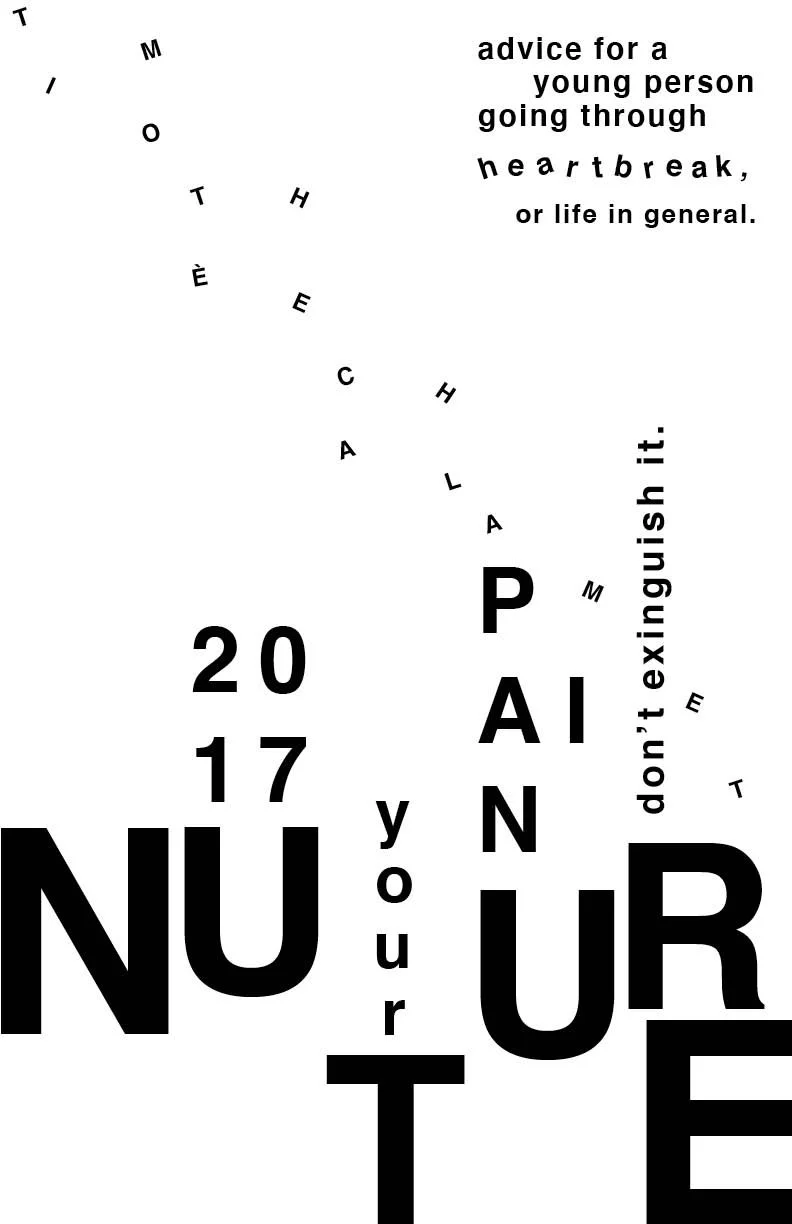
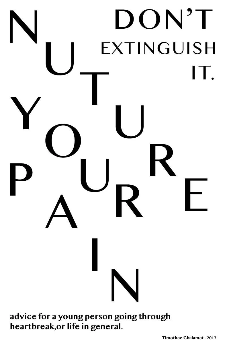
Typographic Compositions (2022, 2023)
Tools: Ilustrator
Project Statement: Experimenting with type to create dynamic compositions with tone, movement, negative space, hierarchy, and metaphoric relation to the copy. Composition 1 was a magazine cover created for a series of spreads made by my classmates in my upper division design class. Compositions 2 & 3 contain my favorite quote, its author, and the year spoken.

Publication ☆
Publication ☆
SANTORINI SUMMER (2022)
Tools: InDesign, Photoshop; photos personally shot on Canon
Project Statement: In “Santorini Summer'' I seek to capture the island — its nature, scenery, food, and water life — by presenting a collection of images in a color scheme that parallels the island's bright composition and mesmerizing sunset. The zine is chronologically organized so audience's can visually experience Santorini over the course of a day like I did — from sunrise to the famous Santorini sunset. I also aim to embody the island’s serene and wholesome feel by incorporating small moments of the trip where my family and I felt most at peace. Throughout the zine, I scatter small symbols that represent the island as a whole — such as a map of the island, Santorini’s archways, and the Greek flag. Every page has a theme and aims to highlight an aspect of the Island’s culture. I use varied typography to title each page so each spread has an individualized mood and reflects the personality of my photography. The layout of the zine is greatly inspired by simplistic, but bold and colorful editorial design. “Santorini Summer '' not only serves as a personal travel diary, but is an example of the type of work I hope to create in the future since I aspire to go into magazine publication. The zine also conveys the point of my life where I grew as a photographer, as I aimed to take photos with more intention and greater meaning. Most of all, the zine is my love letter to the island and hopes to make audiences feel they are on the Santorini itself by exposing them to its beauty through vivid visuals.
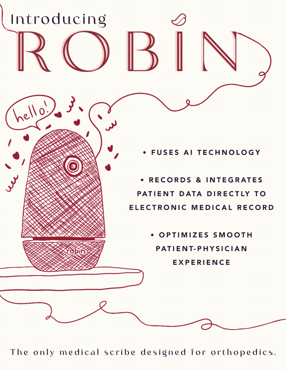
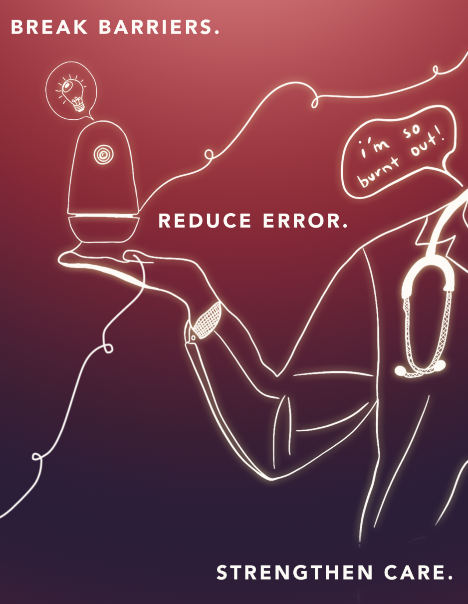
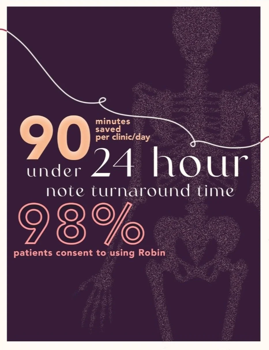
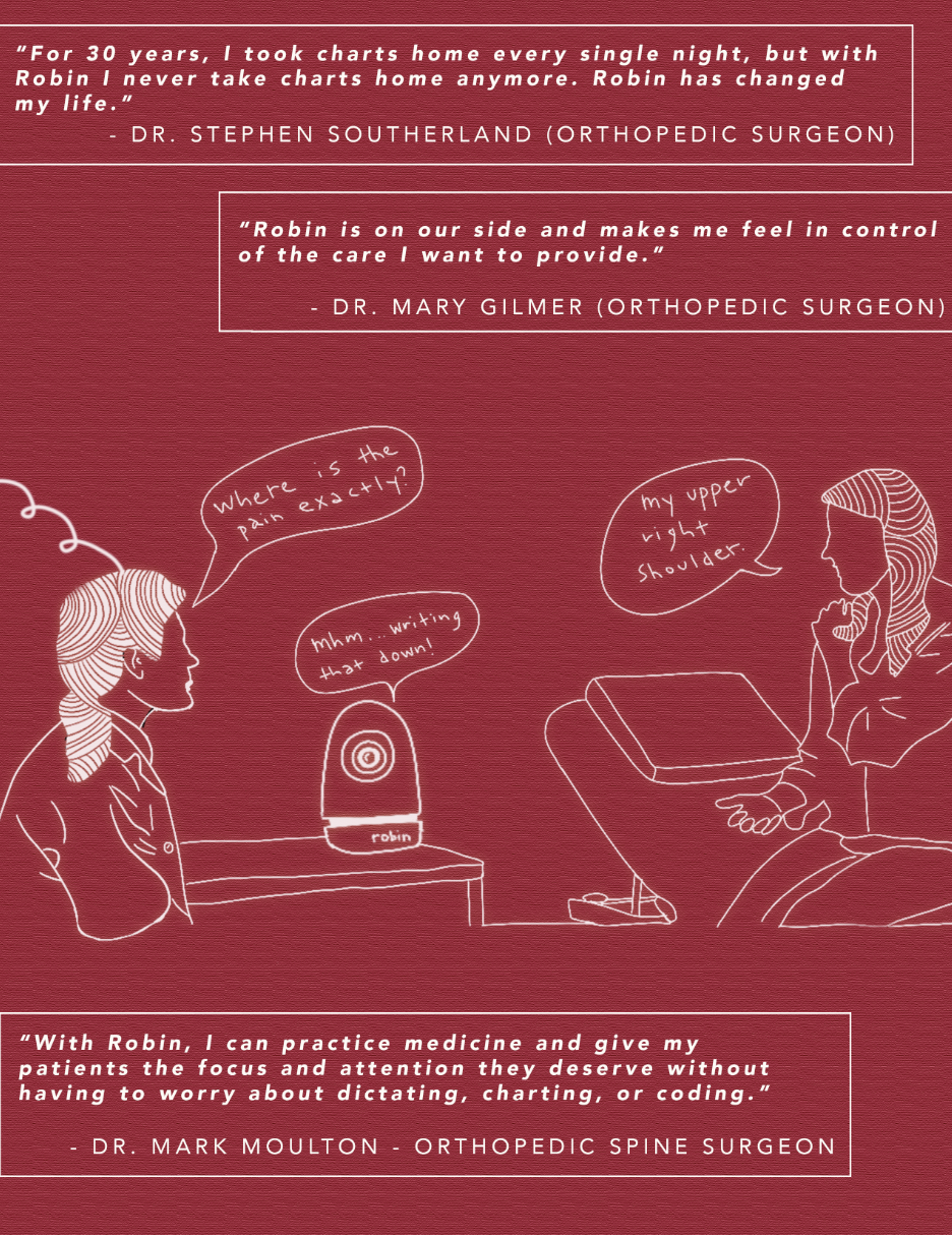
INTRODUCING ROBIN (2022)
Tools: InDesign, Photoshop; Procreate
Project Statement: The goal of this magazine spread is to showcase the AI powered medical scribe device, named Robin, as a human-friendly technology that improves patient care and strengthens doctor-patient relationships. The spread aims to dispel the stigmas surrounding robots in healthcare and promote Robin as a solution that eliminates barriers to health and offers a more humanistic approach to medical technology. The spread targets doctors and patients and emphasizes the importance of maintaining a connection between them. By highlighting Robin's anthropomorphic design and commitment to scientific accuracy and professionalism, the spread will serve as an advertisement for the company, conveying the message that technology can enhance, rather than replace, the human connection in healthcare. The spread will showcase Robin's unique features and benefits and position it as a valuable tool for both doctors and patients, promoting the company's values of patient-centered care and removing barriers to health.
other projects ☆
other projects ☆
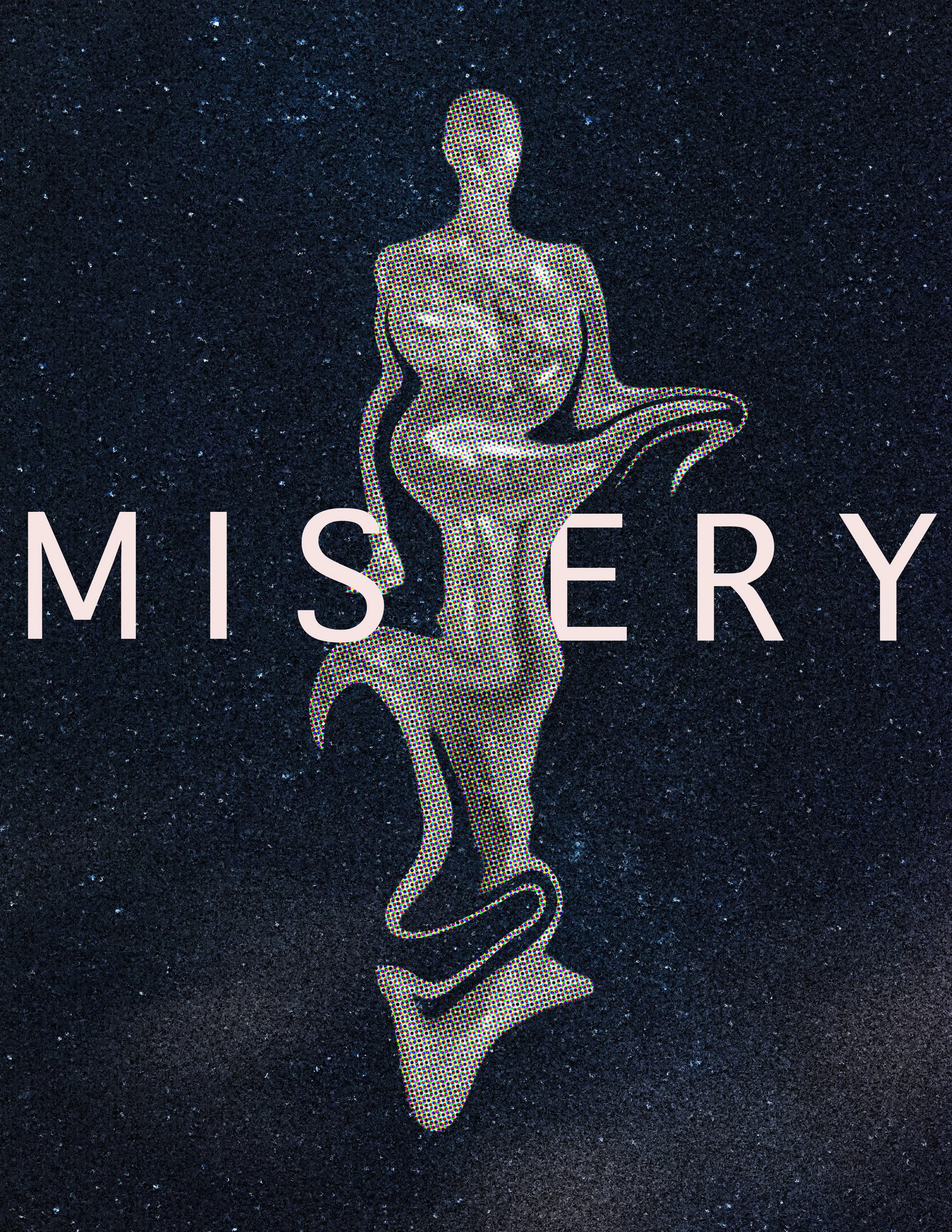

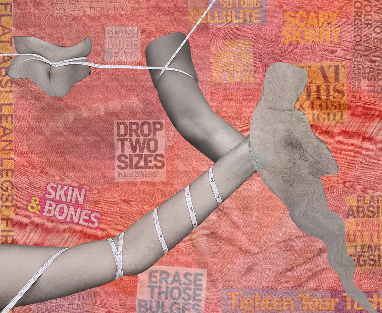
Tools: Photos self-taken on iphone; ghost hand sketched; collages on Photoshop; typography/layout on Indesign
Project Statement: Misery embodies the global physiological and psychological discomfort that arises from condemning media sources; humanity exists within an age of extensive communication outreach, causing more lives to fall victim to viewing messages that generate a pessimistic body image.
Employing Photoshop, a system often utilized for altering bodies into the “ideal physique,” I composed a juxtaposition to the program’s general purpose with an illustration depicting the dire reality of one’s attempt to achieve this physique. Set amidst a canvas of human flesh, a plethora of real-world headlines from Women’s Health, Shape, Who, and Now lay embedded to demonstrate the media’s ability to get under our skin. Influencing our emotions and behaviors, the consequences of these messages are captured in visuals of vocal frustration and physical torso distortion. Photographs of my detached limbs emphasize our tendency to use the body as a means to measure the success of adhering to these projected expectations. Ultimately, my sparsely connected limbs create an inevitable path of humanity resenting their own being — personified through an abashed ghost with an obscure sense of self-identity.
In its entirety, the piece seeks to explore the media’s detrimental toll on one’s body perception.
MISERY (2022)
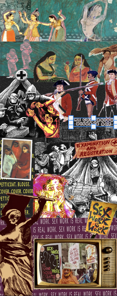
SEX CULTURE, GENDER CONSTRUCTS, AND MORALITY FOR WOMEN IN INDIA (2022)
Tools: Photoshop
Project Statement: This project aimed to explore the impact of colonial relations on laws and norms regarding gender and sexuality in India. I was particularly interested in how colonialism has redefined and enforced sex culture, gender constructs, and morality for women. Drawing from Simone de Beauvoir's "The Second Sex" and Juno Mac and Molly Smith's "Revolting Prostitutes," I delved into the impact of colonialism on prostitution and fashion in India, and how these industries have been stigmatized and regulated as a tool for colonial power at different points of time. My collage aimed to highlight the historic criminalization of sex workers and the establishment of racial and moral hierarchies in colonized India.
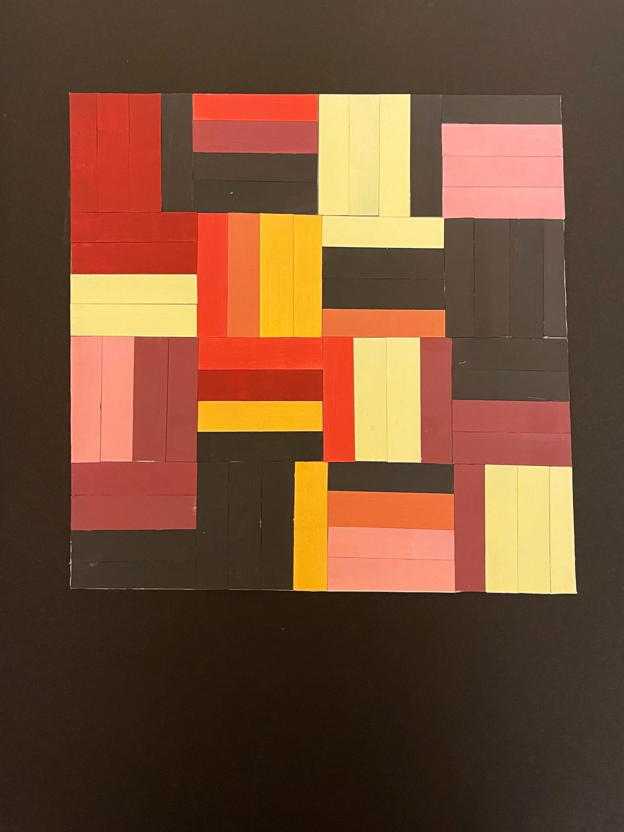
HAND CARVED DESIGN (2021)
Tools: Bristol; acrylic paints; exacto knife; paper cement; rubber eraser; mounting board
Project Statement: Assigned a range of foundational design prompts, I sought to create compositions that expressed individuality in accordance to their theme.
Assymetric Focal Point

Assymetrical Pattern


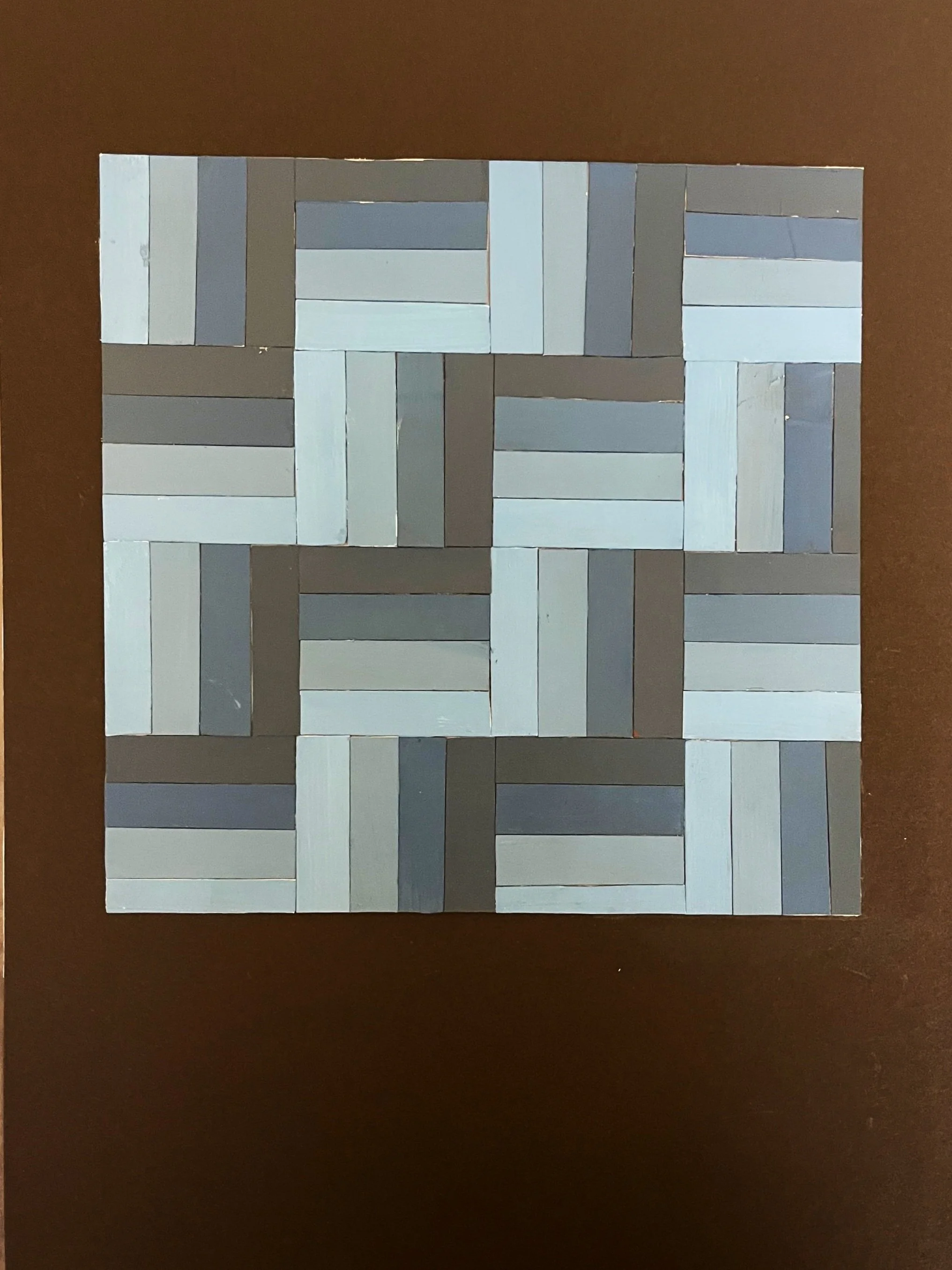
Gray Scale

Tertiary/Tint-Shade Scale
Color Wheel
Illusion of Color